Creating a design library for ForrestBrown

I recently had the pleasure of creating a design library for one of my clients at Atomic Smash. It was a project that involved some learning for me because, until that point, many of the projects I was involved in were at a smaller scale and did not require much more than a lightweight style guide to ensure a good design outcome.
What is a design library?
If you Google the term ‘design library’ you’ll find a myriad of definitions all with a slightly different slant, and just as many methodologies for how to go about building one! In this post, I refer to the design library as a single point of reference which catalogues the decisions that go into using typography, colour, spacing etc. for building and maintaining a digital product. In this way it combines elements of both a style guide and a pattern library, both of which are useful tools in their own right.
I won’t be discussing the best software to use, or integration with a codebase, but these are important considerations you should make with your team before setting out on your own project.
Why build one?
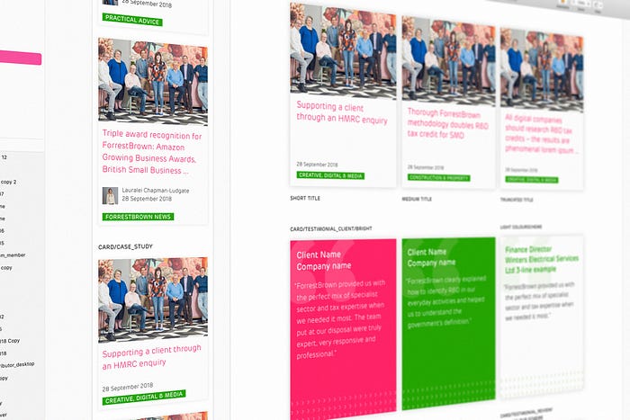
My client on this project, ForrestBrown, had a website which was large, complex and had a wide variety of content and functionality. Over the years since it was launched, a number of designers and developers had worked on the site and it was beginning to show signs of inconsistency, which can lead to a messy interface at best and, at worst, a confusing user experience. With ForrestBrown about to undergo a brand refresh, the time was right to commit to building a design library. Establishing the library would aid us with the subsequent task of completely updating the site templates, a large project which was scheduled in for me and a colleague to work on in tandem. The library would not only allow us to create new templates consistently in isolation, but also help future design team members and the client to scale the site with a solid set of design principles in place to guide it.

Step 1: audit
Working closely with the lovely marketing team at ForrestBrown, we picked apart the bones of the existing site. Not as gruesome as it sounds, this involved making screenshots of every template on the live site and annotating the various components with our thoughts on design successes and failures, along with flagging components which should be alike in design (if they shared the same function, for example) but which weren’t. Sadly there were many of these that had crept in, (some under my watch 😭). While this was a little sobering for the design purist in me, it was a brilliant exercise which informed the components we wanted to migrate to the new site and those we were happy to leave behind in the design wilderness.

Step 2: The foundations
Following the audit, I started out by documenting 3 foundations: colour, typography and space.
Colour
A refreshed colour palette had been prepared by ForrestBrown’s brand guardian, and colour was to be one of the stars of the show for the new look & feel. Therefore it was essential to document the palette by setting up the colour variables with a user-friendly naming convention which could be carried through to the development phase. In previous site updates, names of some colours had become muddled between design and development and we weren’t singing from the same hymn sheet. Having a clear benchmark for both teams proved to be invaluable on subsequent stages of the process and as we continue to grow the site today, the palette is set up to be scalable with the addition of new tints and shades.

Typography
The typography, likewise, was a bit of mishmash of mixed styles. The type is probably the most important building block of any design and it was great to sweep away the dead wood and lock in a concrete scale for desktop and mobile.

Space
The final foundational element was a spacing scale. Setting up a number of predefined spacing units would ensure that when we came to designing the templates there would be a unifying rhythm and harmony from page to page.
Step 3: components
With the foundations in place I moved on to the components. The simplest component to begin with was the humble button, but even this requires a lot of thought which belies its appearance: what is its default state? How does it appear when paired with an icon? What about when it’s in a cluster of multiple buttons? And that’s not to mention the hover states for the 7 colour themes we had already established.

With these decided it was logical to step up in complexity to the call-to-action and the card designs. Early check-ins with the client on these ‘simple’ components helped us to convey how the library was developing and gave them an opportunity to provide valuable feedback. This is a better approach than springing a finished product on your client with a ‘ta-da!’ only to find they didn’t like the type size you’d used in your button which features in 50% of the components you’ve already laboured over!
From here we tackled the components with increasing complexity, but having solid foundations in place made these a breeze to get right after just one or two design iterations. The main site navigation and jump-navigation were two examples of components with a high level of functionality and complexity so they were one of the last things on the list to tackle. With everything else already in place however, they pretty much designed themselves. The project stakeholders could see the design decisions that had gone into them were the right ones, having been through the journey with us from the early stages.
Outcome
With our comprehensive library of components in place, we were ready to build a suite of page templates that would house the site’s varied content types. These were put together with a swiftness and efficiency that would not have been possible without the groundwork that had gone into making the library. It was satisfying at this point to sit back and see the site come together as a whole, with uniformity across colour, typography, space and function. Once again the purist in me could breathe a sigh of relief 😅

Maintenance
Now that the design library is in place, the real work begins. The library isn’t a static product that we can turn our backs on as we did those dodgy components left for dead after the audit! As ForrestBrown’s business goals develop, new design solutions are required to communicate their messaging effectively to their customers and it’s my responsibility to ensure this is done in a consistent fashion, with new design modules following the principles already laid down.
The challenge of adding these updates to the library and disseminating its contents to my team at Atomic Smash and to ForrestBrown’s team is one which can be helped with the right software. Whether you use Figma, Sketch, XD or another tool, you should find a solution to automatically push changes to your teams and keep everyone in the loop.
Final thoughts
There are loads of great resources out there to guide you in setting up your own design library. Use them as just that: a guide. Establishing the best system to document the design principles underlying your own project will require a little flexibility, as no two projects are the same. But I’ve certainly found that setting out with solid foundations is an invaluable part of the web design process that I’d encourage every client and design team to invest in.
